After preparing and publishing documentation, how do you get feedback? Do people actually read the docs you publish?
This blog post summarizes ideas and experiences shared at the Continuous Documentation Regulars.
Close the feedback loop
When you publish documentation and don’t receive feedback, you don’t know if anyone reads it. Should you write more documentation? Are you writing the right documentation for the right people?
Feedback is essential to close the feedback loop. This blog post considers various ways to get this feedback. It is essential to improve, both when updating content and adding content to fill gaps.

Use existing metrics
One way to get feedback is through metrics. Users interact with your documentation website. You can use metrics to learn about your users and the documentation. When you have visitor tracking installed on your documentation site, you can find out the following about your users:
- What pages they visit often.
- Where they click on the page.
- Their journey from page to page.
- How often they return to your site.
- Which country they are from.
- What browsers they use.
- Whether they use mobile or desktop devices.
If your project is hosted on GitHub, you’ll get visitor stats on all pages, issues, and files in your repository for the past two weeks.
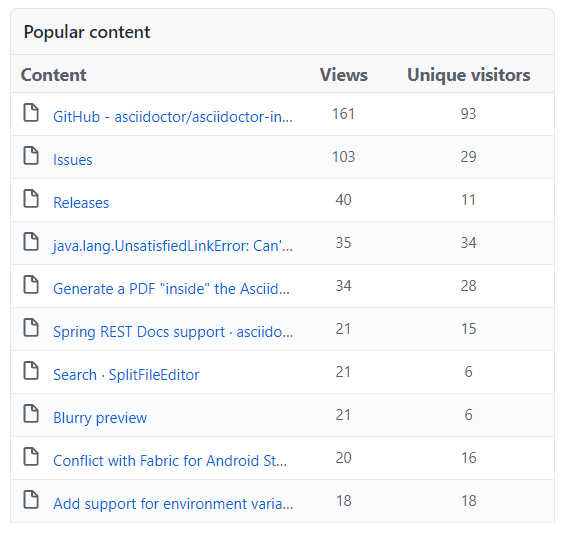
For WordPress sites, the Statify plugin provides the necessary information. If your site is hosted on Netlify, you can enable the Netlify Analytics package without adding JavaScript or cookies to your site. For any other site you can add a metrics package like Google Analytics or Hotjar. To find out what terms users enter into your on-site search either hook it up to your analytics package or retrieve the logs of the on-site search service.
Even simpler than these integrations, use the Google Search Console! You don’t have to collect information on your website with all the cookie content banners. Instead, ask Google what terms people used to find your website.
Something that came to my mind after the Meetup, website analytics people love A/B tests. Did anyone write two different documentation pages, present them randomly to different groups of users, and measure which one received more likes? I wonder if that has crossed the mind of a writer.
Use existing feedback
The good news is that feedback already exists! You can get feedback from support and sales, or read tickets to determine if something is missing in your documentation.
If you’re talking with your (enterprise) customers during onboarding, this is an excellent opportunity to ask for detailed feedback. A new customer will have a fresh view because they are seeing the software for the first time. If they have worked with similar products, they might compare its features and documentation with yours.
Ask for feedback
Another way to gather feedback is through up- and down-votes on each page. A page that gets many up-votes is helpful, one that gets down-votes is not. Unfortunately, you have no data for why the pages are not helpful. This makes it difficult to make improvements.
Use surveys for additional insights, but be aware that these require more time on the user’s side. Surveys allow you to ask general questions about the site, the overall structure, or a specific task.
If you know your stakeholder, you might set up one-on-one interviews. You might be able to test your docs (or an upcoming version) on users. You will use standard user experience (UX) methods like giving test users a task and asking them to think out loud. Looking at other UX research methods, you’ll see a lot of similarities with the earlier examples this post.
How did you get the most helpful feedback?
Given all the options above, we asked: How did you get the most helpful feedback that you have ever received? These are the answers:
- Users wrote to the docs team directly.
- During an intense mob-writing session with the complete team.
- Through support tickets from users.
- By chance, because the reader was happy with the docs and didn’t need to interact with me as a writer.
- When working on a high-profile site, users gave feedback on Twitter.
- Feedback from the people in the company who talk to actual users daily.
Getting the whole team together to perform a “doc-a-thon” (thank you, Victor, for sharing this) seems to be productive. This reminds me of mob programming or a hackathon. For mob programming see Lisi’s blog for a collection of resources for mob programming or the now freely available Mob Programming Guidebook by Maaret Pyhäjärvi and Llewellyn Falco. Use a documentation hackathon if you want multiple teams to work on different tasks.
Let’s look at examples
After all the general discussion in previous paragraphs, it is now time to look at some examples. Read on or jump to the conclusion!
Least helpful: Comments at the end of articles
Have you seen the long comment list at the end of an article? This happens with blog posts on the web and page comments on Confluence sites. Typically, some comments receive replies from the author, or a note that the article has been updated.
As the list of comments grows longer, the comments become less helpful. Please delete old comments that are no longer relevant!
In Confluence, you can use option of inline comments and authors can mark them as resolved. After they are resolved, they are no longer shown.
Issue tracker: Atlassian style
You can use the Atlassian Issue Collector to add a feedback button to any website where you can embed custom HTML and JavaScript.
It’s fully configurable, and will create an issue for you in Jira so you can follow up. See this short (but dated) video for an example.
The fine print notifies you that this will not work on Confluence sites in the cloud or via user macros — yikes!
Minimal: Contentful style
A minimal feedback form is on the Contentful’s docs (thanks Ekaterina for sharing):

This is the most minimal feedback form we’ve seen during this meetup. Just a star rating. No qualitative feedback. Is this helpful to the writer? Let’s see how it compares to other feedback forms.
Simple: Netlify asks for feedback
Looking at examples like Netlify shows that both votes and feedback are possible.
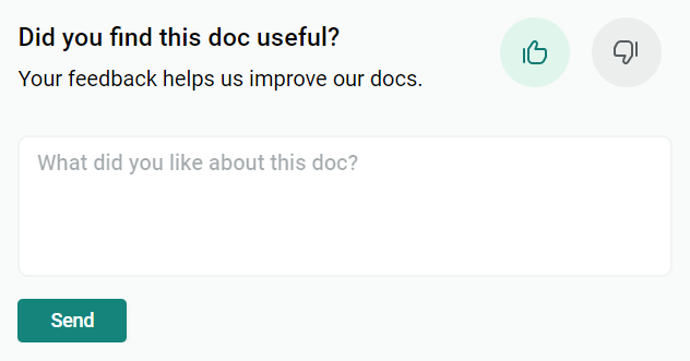
They placed it at the end of the page, so only users who read the article to the end (or at least scroll there) will find it. Victor reasoned that maybe only users who didn’t find what they needed on the page will scroll to the end; all others will leave the page after they find the solution. So the result might be biased, but this might be intended?
The feedback text expands after you selected the up- or down-vote. After the feedback text has expanded, you cannot change your vote. Oops!
Visual: Hotjar style
When users provide feedback to a documentation website, a nice feature is to create a snapshot of the website as it is displayed to the user. The Hotjar feedback button has one of the most advanced user interfaces. After you rate the page, you can write a comment and select an element on the web page to submit together with your comment.
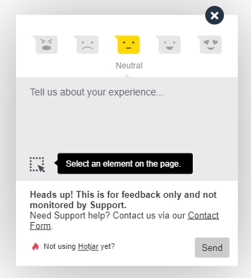
This is impressive, but requires the user to get used to this kind of feedback. This might overwhelm some users.
Errors only: Sentry style
So far, the feedback mechanisms were always visible. What about asking for feedback only when an error occurs? Sentry offers such a service for a broad range of backend and frontend applications. The website owner can add a snippet of JavaScript that is triggered by a 404-page-not-found error, a JavaScript exception, or any other JavaScript event. After the event is created and submitted to a central service user can submit additional information.
As the owner of the site you get events on all errors happening on the site, automatically grouped and de-duplicated, plus individual user feedback that helps you to reproduce and resolve the issue.
You can use Sentry as a cloud service, or host your own Open Source instance. The cloud service offers a free developer tier or paid tiers for higher event volumes and more features.
Mind reading: werstreamt.es style
Ralf shared the German site werstreamt.es that lists which online streaming service provides your favourite movie or series. It forwards the user to the matching streaming service. If the user returns within seconds, the site assumes that the information it provided might have been wrong and asks the user for feedback.
How would a mind reading feedback mechanism work for your documentation site?
Stateful: Microsoft style
Let’s look at a sophisticated solution like the current Microsoft documentation. We pulled an example page from the PowerShell docs.
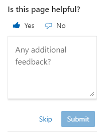
In the top right corner, there is an always visible “Is this page helpful?” message. Awesome or scary: The yes/no switch memorizes the state from the previous visit. After you change your selection, the new selection is sent to the server, and an input field opens for additional feedback.
Open workflow: Using GitHub issues
At Microsoft docs, there is more on the bottom of the page:
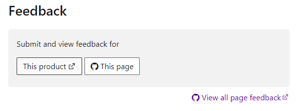
- A link to submit feedback for the product via a new GitHub issue.
- A link to submit feedback for the current documentation page via a new GitHub issue.
- A link to show all previous feedback submitted as GitHub issues for this page (either open or resolved).
The technical audience of PowerShell users, where some of them already have a GitHub account, might be able to handle this. It is an open process, which is positive. However, this looks complicated at first sight and might overwhelm not-so-technical users.
Tool for all sites: Doorbell style
Sven shared the link to Doorbell.io: a cloud service that allows you to customize a feedback form and place it on any website using a snippet of JavaScript and HTML. It also has an API that allows for automation. The questions are configurable, and you can include a screenshot of the page the way users see it when providing the feedback.
When you add an email address to the form, try framing it with the question “Would you like to be notified when we update the article?” (thanks to Stefano for the idea).
Lightweight: A mailto:-link
We saved the lightweight solution for last. You can add an email link to every page and include a page specific subject and body in the email template (thanks to Lukas for sharing). Such a hyperlink could look like this:
<a href="mailto:nowhere@example.com?subject=Feedback to page XYZ&body=I visited this page and ...">
  Send Feedback
</a>
You can add the name of the page via server-side rendering or JavaScript. Using this method, you can respond to those who provide you with feedback. It requires a properly set up user’s email client so users of web mailers might miss out here.
Summary
Qualitative feedback gives writers both motivation and direction to evolve their documentation, while ratings alone don’t help that much. Metrics about how readers use documentation can provide insights that must be validated before they can be applied.
Looking at the options, the mailto: link is the original Web standard to provide feedback on a page. All emails you receive will contain a valid return address to contact your users after you’ve updated your docs. Placing such a link on a public site could attract spam, and users with a web mail frontend might have difficulties using it.
Both Hotjar and Doorbell.io allow for a custom form and follow-up process for feedback you receive. Choosing the right one depends on pricing and personal choice. If you’re already hosting an Atlassian Jira instance, and want to receive feedback on content not hosted on Confluence, Atlassian Issue Collector might be an excellent choice for you.
The Microsoft up-down-vote stands out for placement, user experience, and that it keeps the state when you revisit the page. It raises the bar if you plan to create your own solution.
Depending on your situation, figure out when it would be best to ask for feedback. Both the Sentry and the werstreamt.es case provide great examples.
Please let me know the solutions you’ve tried, or if there is a tool that offers additional feedback mechanisms. If you found this topic interesting, join the Continuous Documentation Regulars Meetup to receive notifications about future events.
Thank you Tara for reviewing my draft version of this post: You found errors, copyedited my writing and gave me hints to improve this post. All remaining errors are my own.